Landing Page
Agency
Design + Dev
Waitlisty
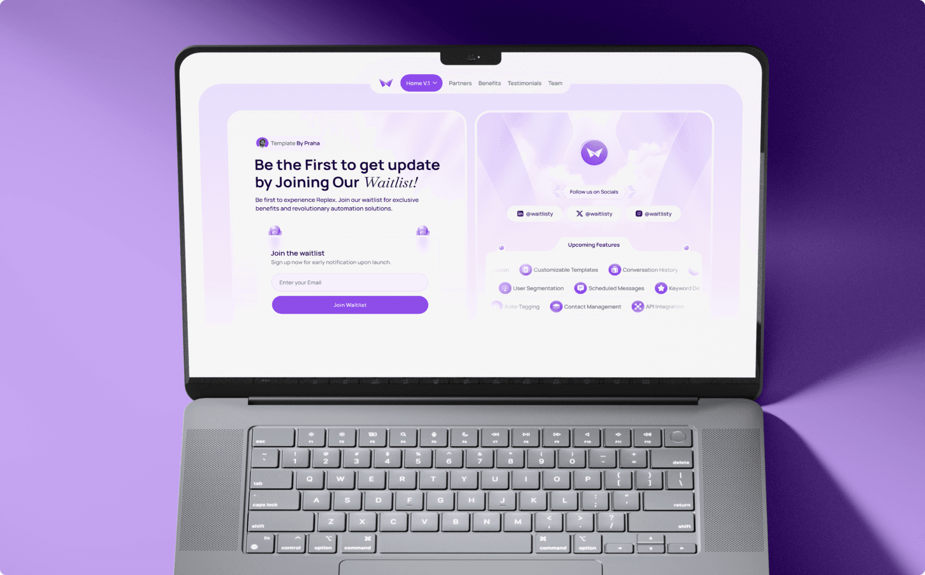
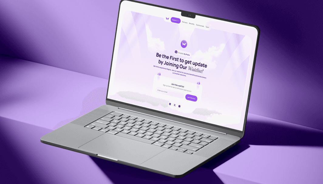
Waitlisty - The ideal template for crafting a sleek and efficient waitlist landing page, meeting all your waitlist needs effortlessly.
How We Started
The vision for this project was to create an inviting, light-themed waitlist page that inspires excitement for the upcoming product launch. Our goal was to design a clean and welcoming experience with a minimalist aesthetic, focusing on simplicity, readability, and an easy-to-navigate layout. The light theme was chosen to convey openness and approachability, making the sign-up process as seamless and user-friendly as possible.
Project Process

Research & Wireframing
We started by examining popular waitlist pages and light-themed websites to gather insights on layouts and user flow. Our wireframes focused on a streamlined structure that highlights key details about the product and leads users naturally toward the waitlist signup. We prioritized a clear visual hierarchy, ensuring the design would keep users’ attention on the main message and call to action.
UI/UX Design
Using Figma, we created a bright and airy design that uses soft colors, ample whitespace, and clean typography to create a calm and inviting aesthetic. The layout is minimalistic yet functional, with subtle accents to guide users’ attention. We also added an eye-catching banner and a visually distinct signup area to encourage users to join the waitlist effortlessly.
Development & Testing
The waitlist page was developed in Framer, with a focus on maintaining smooth, intuitive interactions. We tested across various devices and browsers to ensure the page remained responsive and visually appealing on all platforms. User feedback allowed us to fine-tune elements like button placements and visual flow, optimizing the site’s usability and effectiveness.
Key Features
Bright, Minimalist Design
The light theme features a clean layout with soft pastel accents and ample whitespace, creating a refreshing and approachable look that invites users to explore.
Responsive Design for All Devices
The waitlist page is fully responsive, providing a consistent and engaging experience on desktops, tablets, and mobile devices.
Easy-to-Find Waitlist Signup Section
The waitlist signup area is clearly highlighted with a prominent button and easy-to-fill form, encouraging users to take action without distractions.
Subtle Animations for Visual Engagement
Subtle animations on scroll and hover add an element of interactivity that keeps users engaged without overwhelming the clean design.
Social Proof & Anticipation Elements
Incorporating user testimonials and product highlights helps build credibility, while a countdown timer adds urgency, motivating users to join the waitlist.

Conclusion
This light-themed waitlist page provides a perfect balance of simplicity and functionality. By creating a bright, user-friendly experience, the page effectively draws users in and guides them smoothly toward the signup action. With its approachable design and responsive layout, this waitlist page successfully builds anticipation for the product, making it an ideal tool for generating early interest and capturing user engagement.


