Landing Page
Agency
Design + Dev
SAP
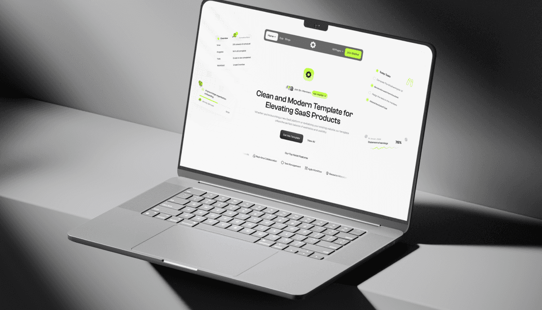
SAP - The ideal template for crafting a sleek and efficient SaaS landing page, meeting all your SaaS needs effortlessly. SAP - The ideal template for crafting a sleek and efficient SaaS landing page, meeting all your SaaS needs effortlessly.
How We Started
Our goal with this project was to design a clean, efficient, and light-themed website tailored for a SaaS business. We aimed to highlight the platform's features while keeping the design minimalistic and user-friendly. The light theme was chosen to create an inviting, modern, and professional aesthetic that would engage users and guide them smoothly through the product's benefits.
Project Process
Research & Wireframing
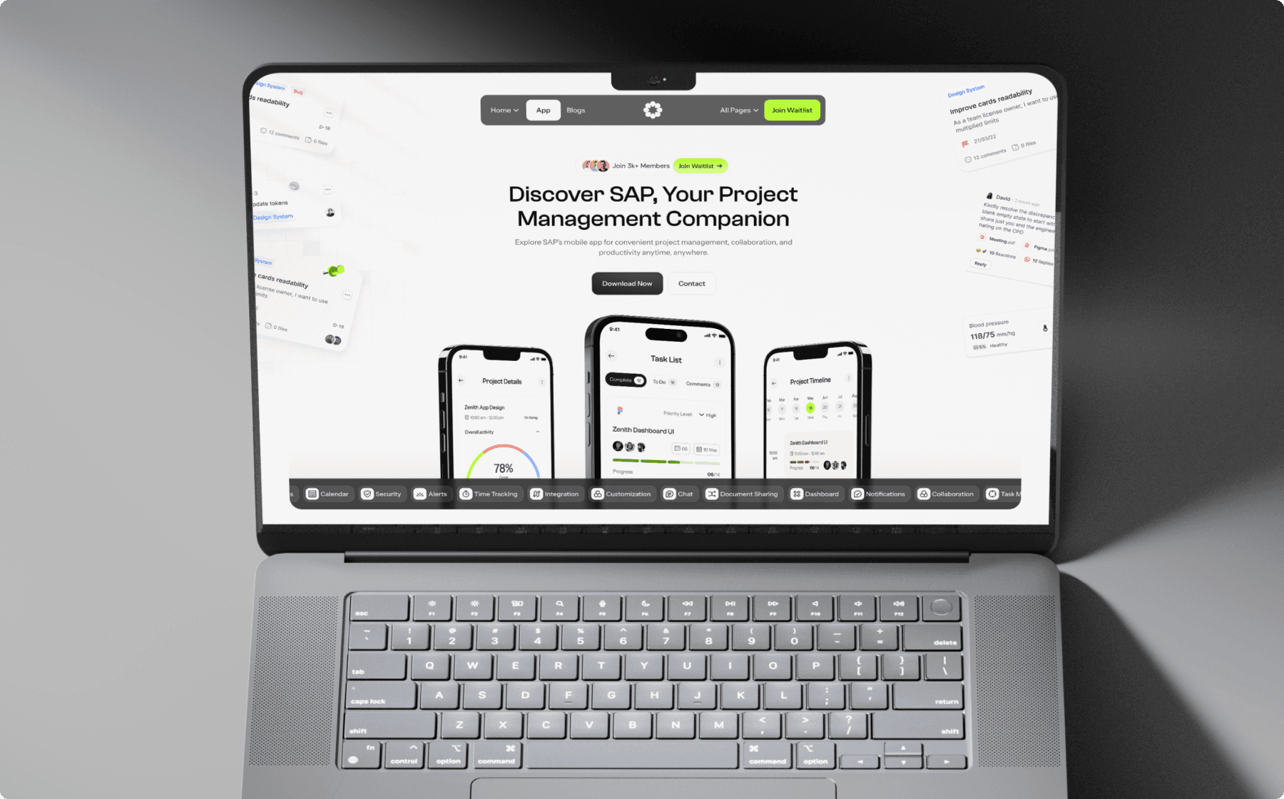
We began by exploring the needs of the SaaS target audience, analyzing competitor sites, and studying current trends in SaaS website design. Based on this research, we sketched wireframes that emphasized a clean layout with prominent sections for product features, benefits, and calls-to-action. Our focus was on creating a layout that enhances user experience while keeping distractions to a minimum.
UI/UX Design
Using Figma, we crafted a light-themed interface that is both functional and visually appealing. We chose soft, neutral colors, spacious layouts, and clean typography to create an open, professional look. The design prioritizes user interaction with strategically placed CTAs and showcases features in a way that’s accessible and visually engaging, aligning with the simplicity and ease-of-use SaaS users expect.
Development & Testing
Our development team brought the design to life in Framer, optimizing animations and transitions to add subtle interactivity without compromising loading speed. After development, we conducted extensive testing on different devices and browsers to ensure a seamless experience. User feedback was incorporated to refine usability, resulting in a polished, high-performing website.
Key Features
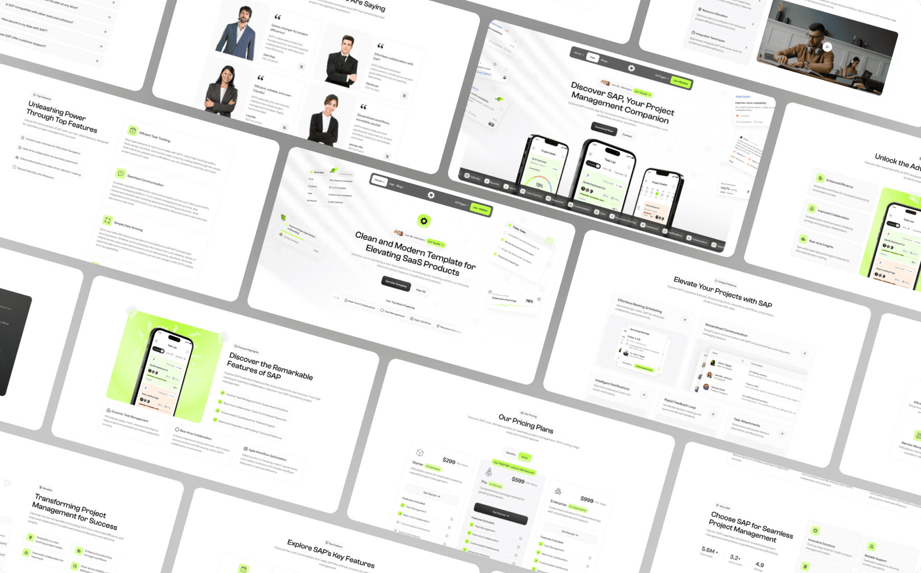
Light, Modern Design
The website’s light-themed design uses ample whitespace, a soft color palette, and minimalist elements to maintain a clean and modern look that appeals to a SaaS audience.
Responsive, Mobile-Optimized Layout
The site adapts smoothly to any device, ensuring a consistent experience across desktops, tablets, and smartphones, which is essential for busy SaaS users.
Clear Feature Highlights with Interactive Sections
The homepage and product pages use interactive elements to showcase features, making it easy for users to grasp key functionalities at a glance and encouraging deeper exploration of the product.
Optimized for Speed and Efficiency
The website loads quickly and performs efficiently, with optimized images and a lightweight framework that ensures a seamless experience and keeps users engaged.
Strategically Placed Calls-to-Action
Well-placed CTA buttons are integrated throughout the design to guide users toward key actions, such as signing up or scheduling a demo, driving engagement and conversions.
Conclusion
The light-themed SaaS website achieves a balance between aesthetic appeal and user-centric functionality. By prioritizing clarity, ease-of-use, and efficiency, we crafted a site that communicates the product’s value effortlessly while creating a pleasant and professional browsing experience. This design not only enhances brand credibility but also supports user engagement, making it an ideal fit for SaaS companies looking to attract and retain users.


