Landing Page
Agency
Design + Dev
Gency
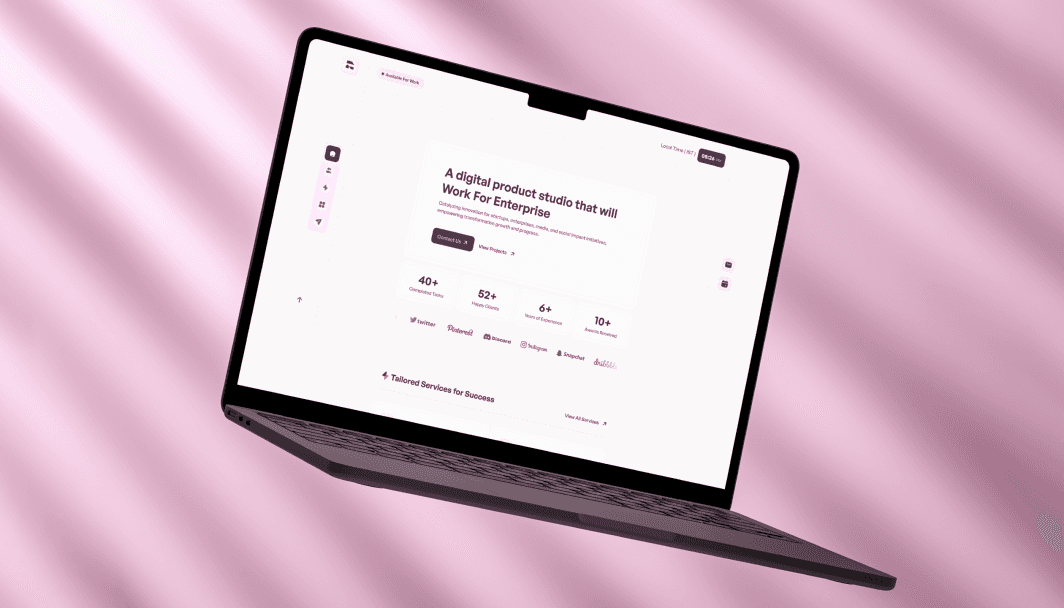
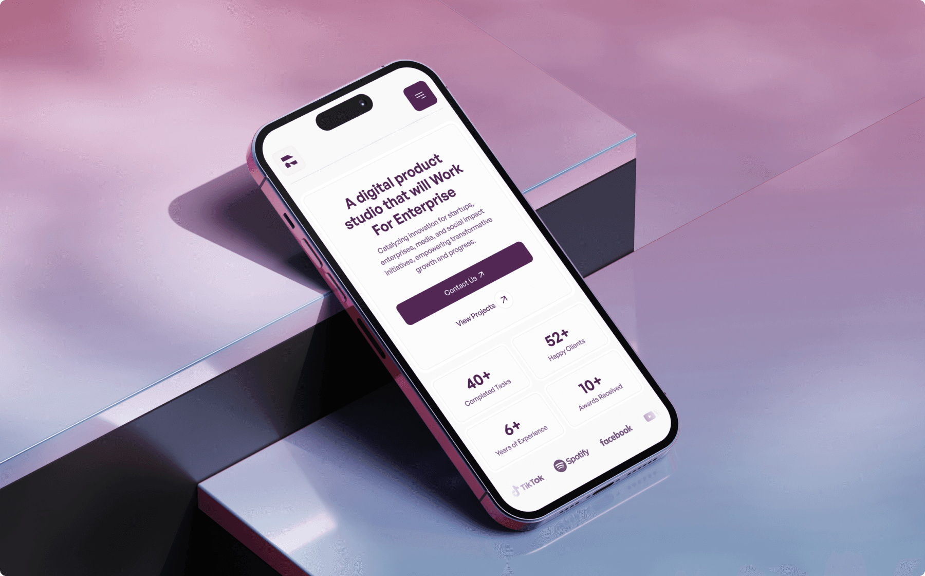
Gency is a sleek and minimalist website template designed specifically to meet the needs of agencies.
How We Started
The project’s vision was to develop a clean, minimalist, and light-themed website for a modern agency. The goal was to provide a sleek, professional look that emphasizes simplicity and elegance, allowing the agency’s portfolio and services to shine. We aimed to create a website that would resonate with clients seeking a refined online presence, focusing on intuitive navigation and a visually appealing layout that enhances user engagement.
Project Process
Research & Wireframing
We began by analyzing the agency’s target audience, competitor websites, and the latest UI/UX trends to ensure we aligned with industry expectations. The wireframes prioritized a light aesthetic, with a focus on whitespace, minimalism, and functional flow. This early stage helped us map out an experience that balances elegance with usability.
UI/UX Design
Using Figma, we crafted a light, airy design that emphasizes modern simplicity. We utilized subtle colors, clean typography, and well-structured layouts to keep the focus on content while creating a sophisticated look. With the light theme in mind, we ensured every visual element contributed to an open, welcoming feel, essential for showcasing agency work effectively.
Development & Testing
Once the design was finalized, we translated it into a fully responsive website, building in Framer to optimize animations and interactivity. Our development team conducted extensive testing to ensure compatibility across all devices and browsers, focusing on delivering a smooth and immersive experience. User feedback allowed us to make fine adjustments, enhancing both aesthetics and functionality.
Key Features
Light, Minimalist Design
The website features a light-themed design with ample whitespace, soft color schemes, and minimalistic icons, creating an airy feel that directs attention to content.
Responsive and Mobile-Friendly
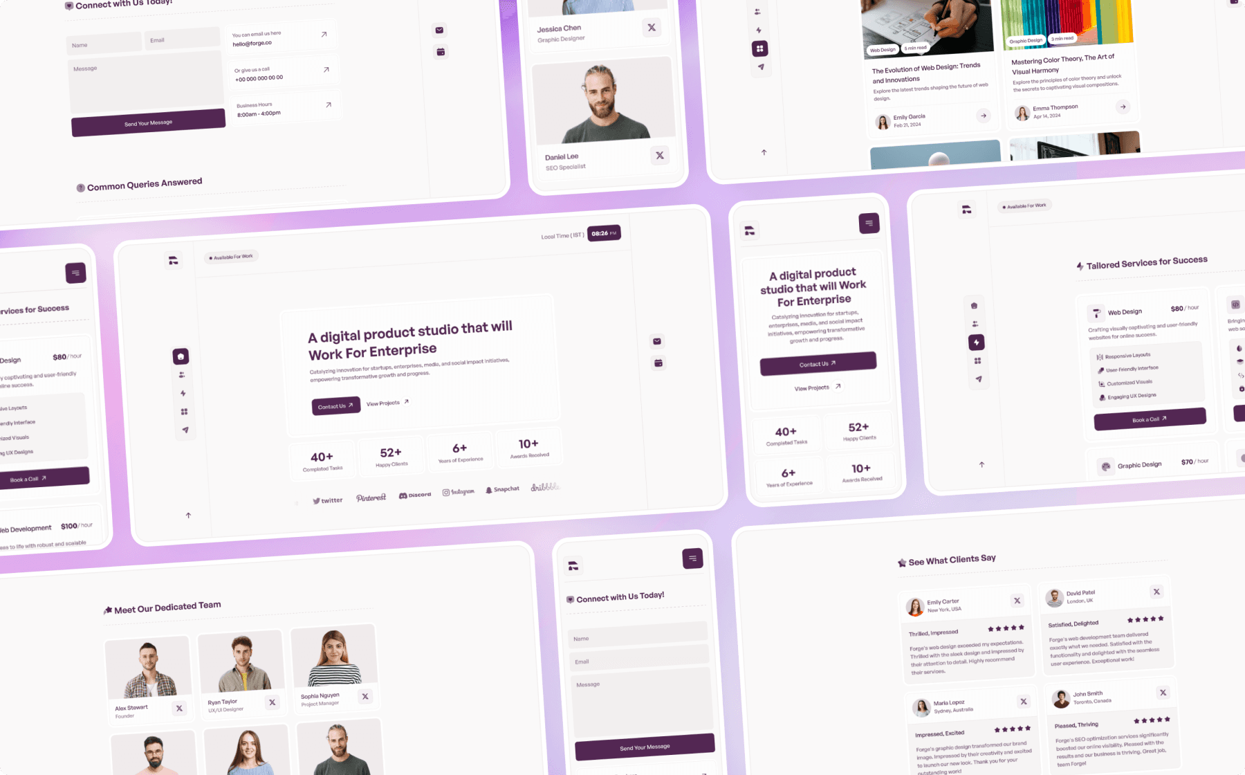
Each page is optimized for desktop, tablet, and mobile screens, ensuring a consistent and enjoyable experience across devices.
Intuitive Navigation with Emphasis on Portfolio Showcase
The layout is designed for easy navigation, with prominent call-to-action buttons and dedicated sections that allow the agency’s work to be the focal point, drawing in potential clients effectively.
Quick-Loading and Optimized for Performance
The website is built for speed, with optimized images and lightweight code to ensure fast load times, reduce bounce rates, and enhance user satisfaction.
Clear, Readable Typography
A modern, easy-to-read font is used throughout, ensuring text remains legible and visually appealing, complementing the overall minimalist design.
Conclusion
This light-themed agency website successfully merges aesthetic appeal with functionality. Designed to showcase the agency’s work, it provides a sophisticated, professional online presence that is both visually striking and highly usable. The combination of a light, minimalist design and seamless performance makes it a perfect choice for agencies seeking to attract clients with a refined, modern touch.


